I’m trying to recreate this graph (from the cover of Show Me the Numbers) with R and ggplot2:

A kind fellow (named Vivek Patil) on the ggplot2 mailing list got me started with some code:
tea=c("Arabian","French Roast")
Sales=c(10000, 15000)
Plan=c(12000,12000)
Variance=c(-2000,3000)
df=data.frame(tea=tea,Sales=Sales,Plan=Plan,Variance=Variance)

library(ggplot2)
library(gridExtra)
library(ggthemes)
salesplan=ggplot(df,aes(x=tea,y=Sales,fill=tea))+geom_bar(stat="identity")+
geom_segment(aes(x=as.numeric(df$tea)-.475,xend=as.numeric(df$tea)+.475,y=df$Plan,yend=df$Plan))+
ggtitle("Sales vs Plan")+ coord_flip() +theme_few()+scale_fill_few("medium")+
theme(legend.position="None", axis.title.y=element_blank(),axis.title.x=element_blank())

varianceplan=ggplot(df,aes(x=tea,y=Variance,fill=tea))+geom_bar(stat="identity")+
coord_flip()+ggtitle("Variance to Plan")+theme_few()+scale_fill_few("medium")+
theme(legend.position="None",axis.text.y = element_blank(),axis.title.y=element_blank(),
axis.title.x=element_blank())

grid.arrange(salesplan,varianceplan,ncol=2)
That code generates this graph:

I built on that by adding more data, saving it to a CSV file and then running the ggplot2 again. Here is the CSV data:
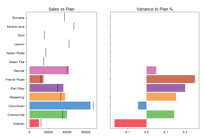
,Product,Sales,Plan,Variance,Variance2,Type
1,Arabian,10000,12000,-2000,-0.1667,Espresso
2,French Roast,15000,12000,3000,0.2500,Coffee
3,Green Tea,18000,15000,3000,0.2000,Tea
4,Mint,19000,16000,3000,0.1875,Herbal Tea
5,Italian Roast,19000,17000,2000,0.1176,Espresso
6,Sumatra,33000,37000,-4000,-0.1081,Coffee
7,Earl Grey,36000,30000,6000,0.2000,Tea
8,Darjeeling,38000,33000,5000,0.1515,Tea
9,Chamomile,40000,35000,5000,0.1429,Herbal Tea
10,Garuda,42000,40000,2000,0.0500,Espresso
11,Mocha-Java,45000,47000,-2000,-0.0426,Espresso
12,Lemon,50000,42000,8000,0.1905,Herbal Tea
13,Columbian,65000,68000,-3000,-0.0441,Coffee
Here is the code:
df <- read.csv(file="DisplayTableData.csv", header=TRUE, sep=",")

library(ggplot2)
library(gridExtra)
library(ggthemes)
salesplan=ggplot(df,aes(x=Product,y=Sales,fill=Product))+geom_bar(stat="identity")+
  geom_segment(aes(x=as.numeric(df$Product)-.475,xend=as.numeric(df$Product)+.475,y=df$Plan,yend=df$Plan))+
  ggtitle("Sales vs Plan")+ coord_flip() +theme_few()+scale_fill_few("medium")+
  theme(legend.position="None", axis.title.y=element_blank(),axis.title.x=element_blank())

varianceplan=ggplot(df,aes(x=Product,y=Variance2,fill=Product))+geom_bar(stat="identity")+
  coord_flip()+ggtitle("Variance to Plan %")+theme_few()+scale_fill_few("medium")+
  theme(legend.position="None",axis.text.y = element_blank(),axis.title.y=element_blank(),
        axis.title.x=element_blank())

grid.arrange(salesplan,varianceplan,ncol=2)
And here is the graph:
As you can see, I’ve got some more work to do. I’m reading through the docs and trying things out. Hopefully, my next post will show complete working code.